 Do you get tons of visitors to your website? Yet, for some reason, none of them ever becomes a client?
Well, one way you might be able to generate more enquiries is to think more like an online retailer.
But before I tell you exactly how, there’s just one thing you’ll need to know – what it is that makes a great online retail site.
And, to see what that is, you only have to look at the ultimate online retailer Amazon.
It’s the role model for any eCommerce website.
It has a clean, uncluttered design and is so easy to use. It also has a whole load of great user features that add value to the shopping experience and help you to make a much more informed purchase.
Here are just a few typical examples:
- Thoughtful item recommendations, related items and other helpful product suggestions
- Customer reviews and product ratings
- A Look Inside feature that lets you browse through parts of a book before you buy
- A variety of shipping options
So What’s the Point?
Well basically, aren’t you selling something on your own website too?
OK, unlike an eCommerce website, you’re selling a service you can’t physically buy over the net.
But that shouldn’t stop you.
In other words, you can still incorporate features into your own site that encourage people to buy or make an enquiry – in just the same way that online retailers do.
So what kind of features can you introduce?
Well, the following are two ways in which I improved my own website that were inspired by eCommerce. There’s no reason why you shouldn’t do the same too:
➜ Highly visible call-to-action buttons
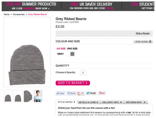
Have you ever noticed how on online shopping sites the Add to Cart, Proceed to Checkout or Confirm Order button always stands out from the rest of the page?
Take, for example, the following typical product details page on popular fashion retail site Boohoo.com:
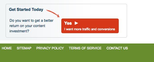
Now take a look at the very bottom of the home page of my own website.
Spot the similarity?
You’ve got it. They both have just what I’m talking about – a prominent call-to-action button.
Sneaky tip:
Choose brighter, contrasting colours for smaller call-to-action buttons so that they grab your visitors’ attention. But for larger buttons, choose colours that blend in more with the colour scheme of your page.
However, choose your colour carefully to avoid clashing with your website’s overall design. If in doubt, consult a graphic designer or use an online colour selection tool such as WebFX Color Picker or Adobe Kuler.
People almost can’t help but click on buttons. So if a visitor is interested in what you’ve got to sell, they’re all the more likely to take the action you want.
In the above example on Boohoo.com, the action they want you to take is to add the item to your basket. In the case of my site, it’s to get prospective clients to visit my Contact Us page, where they can find out more and make an enquiry if they wish.
This leads me on to the next thing:
➜ A fully featured query form
Just imagine for a moment you’re shopping on an online retail site and you find exactly the product you want.
Then you discover that you don’t actually have the option to make the purchase online. Instead you need to either email or phone the retailer to place your order.
Now doesn’t that sound far too much like hard work? Be honest – you’d much rather click on a few buttons, enter a few details, click to confirm and be done.
So think about this for a moment …
Imagine a similar situation where you’re a visitor to your own website. You decide to make a query, but only have a choice between picking up the phone and sending an email.
So what are you going to say?
Yeah, you’ve got to start thinking about things. So it’s very tempting to put that query off until another time – and the only trouble is that you never do come back.
That’s where a fully featured query form comes in.
To see what I mean, let’s look at a clip from my own query form below:
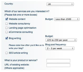
Can you see why making a query is so much easier?
That’s right. Because the form does all the thinking, so you don’t have to. All you need to do is fill in a few fields, select a few options and away you go – you’ve got the ball rolling.
Easy isn’t it?
But just one final thing
All this clicking and selecting is great. Every button you click conveys a sense of action – just like placing an order on an eCommerce website.
But not everyone’s the same. Some people prefer to call. Others like to email. So make sure you give your prospects all three options.
Remember how I included variety of shipping options in my list of great Amazon user features? This is just the same.
The more options you give, the more likely you’ll get a sale.
Have Your Say
Do you think these two ideas would work well on your website? Do you have any special conversion tricks of your own? Let us know by adding your views to our comment section below.
Stuff You Can Tweet:
- One way you can generate more enquiries from your website is to think more like an online retailer. [Tweet this]
- People can’t help but click on buttons. Turn a call to action into a button and more people will buy. [Tweet this]
- The more contact options you offer on your website, the more likely a prospect will get in touch. [Tweet this]
In our next post: Who else has never read a book since school? Find out how reading books sucks if YOU want killer copywriting gigs.
 About the Author
 Kevin Carlton is an IT copywriter and blogger based in Staffordshire in the UK. He is owner of freelance copywriting service Write Online, which helps technology companies get the most out of their online presence.



Thanks for the suggestions. Promoting myself isn’t something I do well, and you’ve made your points seem do-able.
(Followed your comment on a blog at “Make a Living Writing” I’m subscribing!)
Hi Lori
The call-to-action buttons are as easy as pie. And practically anyone can draw their own buttons if they want.
The fully functional contact form may be more involved – depending how your website is set up. But if you’ve got a site that’s based entirely on WordPress I expect there a plugins that can do this kind of thing.
Thanks for commenting and please let me know how you get along with the suggestions.
Well darn. There you go again with the good ideas. Making me change up my contact form and stuff, so it’s easier for my prospects. How dare you!
Most of my clients call or email me, and most never touch the form…but maybe THAT’S why? I didn’t make it easy enough for those needing “hand holding?” Maybe so.
I like your query form by the way. And I’m planning on making my next project have more of an eCommerce site-type feel, this post came right in time! ;-)
Jarvis
I have to admit that my query form still needs refinement. But you simply can’t have everything you want on your first website.
What it needs is more bits of validation code.
For instance, prospects can side-step entering a budget for their project. I really could do with forcing them to specify one. That way, I can filter out those who are only prepared to pay peanuts.
One thing I’m definitely confident about Jarvis – and that is you’ll take these ideas and make them better.
Great article, Kevin, filled with a lot of good advice. Thanks for all the great ideas, I feel like I just learned a lot today.
Brent White
Brent
I’m so glad these tips were of help. The next thing, of course, is to implement them.
Another great article. One thing I’ve learned in all my time in marketing is that there always needs to be a CTA visible and clickable wherever the prospect is looking on the page. And that if you don’t want to overwhelm with CTA buttons, keep the content shorter and more concise. So far, so good. But there’s always room for improvement.
(Off to work on my online form…)
Erica recently posted…Write Time, Write Place, Just Write
Too right, Erica, there’s always room for improvement – whatever stage you’re at.
I’ve personally got a list of future website improvements as long as War and Peace.
Each one might only make a small difference to my conversion rate. But, as we all know, when you make lots of little improvements it all adds up to make one giant one.
I love the “Highly visible call-to-action buttons” idea, it is great but I must disagree with you when it comes to adding “A fully featured query form”.
Because you are selling a service, you want people to be impressed by your work first and you want them to contact you so you can have a better chance to get know them, and close a deal with your skills, adding such form will lead to people checking the form first before checking your impressive work, and leave.
Also you would be revealing your price to all your competitors.
Many thanks and Best wishes!
Thanks for adding your own views Mitch.
I totally agree that a contact form will put some potential clients off. This is the very reason I suggested making it part of a wider range of contact options. That way, prospects can choose the method of contact they prefer.
As it happens, I don’t actually reveal prices in my contact form. I only ask people to specify a budget. This helps to filter out time wasters.
Although some copywriters do quite well out of publishing their rates, especially when they present them in imaginative price structures, I do agree that showing them on your website isn’t generally a good idea.